Isaac

Thursday, December 30, 2010
Busy December, Beowulf Outline
December has been one busy month. I did find time to finish going through Beowulf picking out scenes that I want to illuminate. I have 37 picked out and I'm currently drawing on number 19. My plan is once I have all the scenes drawn out I'll start placing them on mock up pages with text to see if I need to add in any extras and just what it's going to start looking like.
Thursday, December 2, 2010
Back to Beowulf Project.
Playing with drawing and painting in the style of Cotton Claudius B.iv again. I haven't run across swords or helmets painted in the manuscript, as where I have found them, they are on unfinished pages and are just inked. Skin tone is also up in the air. Where I have found it is in the dealing with Adam & Eve and their being cast out, and then they are painted white.


Isaac
Monday, November 15, 2010
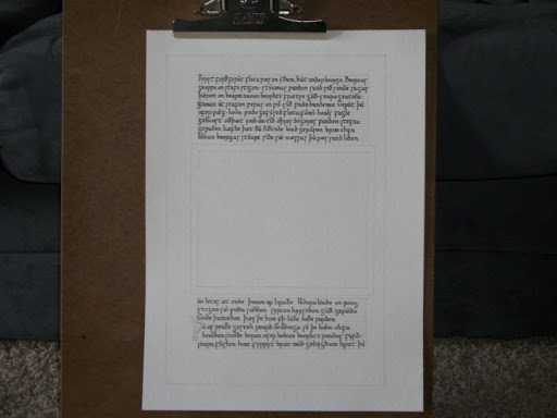
Anglo-Saxon Calligraphy - Heart of Fire & Exeter riddle #50
Anglo-Saxon Calligraphy modeled after the Exeter Book.
965 – 975 AD
Poems:
Heart of Fire by Elanor O’ Ruark
Translation of Exeter Book riddle 50 by Kevin Crossley-Holland
Two sheets side by side. I still need to mat and frame these for display.


965 – 975 AD
Poems:
Heart of Fire by Elanor O’ Ruark
Translation of Exeter Book riddle 50 by Kevin Crossley-Holland
Two sheets side by side. I still need to mat and frame these for display.

Image of the first page.

Image of the Second Page.

Isaac
Saturday, October 16, 2010

Friday, October 15, 2010
A Few Anglo-Saxon (Old English) Calligraphy Hands
I've been looking at and comparing various Old English manuscripts for awhile now. I've been using books as well as electronic facsimiles. Much like handwriting of today, it's pretty much the same basics, just a few changes between each hand.
A Few Anglo-Saxon (Old English) Calligraphy Hands:

A Few Anglo-Saxon (Old English) Calligraphy Hands:

Isaac
Monday, October 4, 2010
Anglo-Saxon Culture Interest
With all the time I've been spending looking at the manuscripts I've gotten interested in the rest of the Anglo-Saxon culture. To further this I've picked up two books, Dress in Anglo-Saxon England Revised and enlarged edition by Gale R. Owen-Crocker and Anglo-saxon Food and Drink by Ann Hagen.
Both have turn out to be really nice reads. Both authors managed to give a lot of information is nice ways to the point I didn't feel like I was reading a typical history book.
Dress in Anglo-Saxon England references many of the manuscripts I've been looking at while it tries to put together the picture of how the Anglo-Saxons' dressed. She mentions several times about items that are alluded to in the illuminations, such as decorative trim on sleeves, as well as objects that do show up, such as cloak pin, and how minor changes in things such as hair style, beard, shoes, clothes can help distinguish who is involved in the scene, older men tend to have beards, a halo and lack of shoes for an angel.
The History of English Handwriting book did prove to be a short read. I really didn't get "oh that's cool" moments from it, but I'll let it sit awhile and read it again.
I have been working on a few leather working projects. My wife now has a belt for her garb and I've been working putting together a ring frame pouch. The Dress in Anglo-Saxon England talks about rings found in graves are now thought to be pouch rings instead of suspension rings or bracelets. My internet searching didn't turn up much of anything on the subject, so I'm currently going with a general design for the pouch that's seen in the Manesse Codex and a few latter manuscripts.
Isaac
Wednesday, September 29, 2010
Books for Research
Picked up copies of "The History of English Handwriting AD 700 - 1400" by Sir Edward Maunde Thompson and "Parker Chronicle and Laws Corpus Christi College, Cambridge MS 173" from the Early English Text Society Original Series.
The History of English Handwriting is taken from an off print of the original article which was first delivered in 1899 to the Bibliographical Society and then published in the Society's Transactions the following year. Tinger of the Stripe, the publishing company to do this version has added additional illustrations. Over all this should be a short interesting read.
Having a hard copy of the Parker Chronicle is nice, as the images I had just didn't have the resolution to get a good look at the calligraphy. The different hands in the Parker Chronicle is very similar to the other Anglo-Saxon/Old English hands I found in other manuscripts. The differences are in little flourishes.
For my History project, I think I'm going to be combining most of the flourishes I like the best from the different Anglo-Saxon calligraphy. I've done a test run using a cartage pen and the hand that's used on the Beowulf manuscript. Over all, it went rather well, with only a few mistakes. I'll be making some changes to my plan that will help create a better finished project.
The Catalogue of Digitized Medieval Manuscripts has been a wonderful source for having a lot of good links to various Old English Manuscripts. Old English List
Isaac
Wednesday, September 15, 2010
Sharp Change of Direction
I'm making some profound changes to my book project idea.
While doing some more searching for digital facsimiles on the web, I ran across one of the many Anglo-Saxon chronicles. It's known by several names, the Parker Chronicle, the Winchester Chronicle, or Manuscript 173, and I found it here at Parker Library on the Web.
Image of f 11 R:

I've decided to attempt a few quires, or loose booklets, based on this manuscript for a "History" theme arts and science comp that's coming up in December. I'm only planning on quires right now as I'm still working on learning the book binding arts, and making the quires is one of the first steps in making the book. I also don't know if I have the time to do all the calligraphy. I think I've nearly pulled together all the information I want to include right now, so it's time to work on my calligraphy and layout.
Isaac
Monday, September 13, 2010
*chirp chirp*
Did way to much inkle weaving the other weekend. Did so much that my hands hurt and the joints were really stiff for most of a week. Note to self: Weave off and on through out a week, don't do a full band in a single day.
Other then recovering and getting stuff done like house work, I have put in some time inking designs. I need to go get copies made of a few items for cut and paste and even some color tests.
Other then recovering and getting stuff done like house work, I have put in some time inking designs. I need to go get copies made of a few items for cut and paste and even some color tests.
Thursday, September 2, 2010
Yet another Project
Another new project. Yea, just what I needed, another project. hehe
I've been mainly working on this one during lunch breaks at work well at least the drawing of the pages. I've decided to do a small book. Yea, a book. I've been doing some research into book binding, nothing to deep yet, but it's been turning the gears in the head. So, I've decided to tackle something smaller, it's going to be about a 5 x 7 in page size. It will be in the style of Taymoth Hours or the Yates Thompson 13, a book of hours from the 2nd quarter of the 14th century. It can be found here. I've gotten 34 pages sketched out and I've started to lay out the calligraphy.
I'm still working on charter designs. I've got the cleaned up and inked. I need to make a run to the copy shop and then do some more cut and paste.
I've also got the inkle loom out and been doing some weaving. Making some bands to go on the T-tunics that Ginger's made.
Isaac
Monday, August 23, 2010
More Charter Designs
I've been working on several different projects little by little right now. I have two more charter designs that I'm working on finishing up. This time a Sable Talon and a Compass Rose.
Sable Talon in done in the style of the Grandes Heures of Jean, Deke of Berry. The Grandes Heures was finished in 1409, and it thought to have been commissioned around 1407. The book's 126 folios measure 400 x 300 mm. I've used pieces from the "simple" pages to make the illuminated boarder. Long necked dragons are very common on these "simple" pages as well as grotesques. I've used an armored half-man/animal grotesque since the award deals with the field of combat.

The Compass Rose is done in the style of the Macclesfield Psalter. The Macclesfield Psalter was made in East Anglia in the second quarter of the 14th century. I've used pieces of two different folios for the Compass Rose design. I started with f. 87r for the general shape of the boarder and I replaced the upper flower in a circle with the Award's registered badge. The other page is f 104v for the larger capital T and some of the design work on boarder.

The Compass Rose is still just in pencil. Because of the extra illuminated letters, I had to work on the calligraphy spacing before I could nail down placement on the boarder and line fillers. I'll be able to clean it up and ink it soon.
Isaac
Tuesday, August 17, 2010
Books, Books, Books
I haven't done to much work on my calligraphy or illumination lately. I've been doing more reading.
I went ahead and picked up a cartridge pen made by Manuscript so I can do some practice calligraphy at work during lunch breaks at work. The dip pens were just to much trouble to try and get set up, used, and then cleaned up in the little free bits of free time.
For my birthday, I received some money, so I made an Amazon order for some more books. I picked up the following: Beowulf: Facsimile of British Museum MS. Cotton Vitellius A xv, with a transliteration (Early English Text Society Original Series), Pen and Parchment: Drawing in the Middle Ages (Metropolitan Museum of Art Publications), The Macclesfield Psalter, Italian Illuminated Manuscripts in the J. Paul Getty Museum (Getty Trust Publications: J. Paul Getty Museum), The Gilded Page: The History and Technique of Manuscript Gilding plus a few other non C&I related books.
The Beowulf book is going to be great for my Beowulf project when I get back to it.
The Macclesfield Psalter is two parts, the first is on the Psalter, studies into it's making, the content it shows, ect and the 2nd part is of the facsimile of the Psalter's pages. I can't wait to dive into this book. I think it's going to make a really great source of inspiration.
I've been reading The Gilded Page: The History and Technique of Manuscript Gilding and so far it's really good. While I've read some of the author's sources like The Materials and Techniques of Medieval Painting, and The Craftsman's Handbook: the Italian "Il Libro dell' Arte" it's been years. The recipes the author has in the book go from the very period to an easy modern recipe using white glue as it's main ingredient to make gesso. I'm now thinking I'll have to invest in some gold leaf and other supplies to try out the new knowledge.
Isaac
Wednesday, August 11, 2010
Queen's Rapier almost done
That's right. A few more times at doing the calligraphy and I got a copy I was happy with and it has the right spaces. So I went and made a few copies of each the illumination and the calligraphy and played cut and paste. I still need to make a final copy and type up an informative blurb.


The design is taken from "Verses about the Bleeding Host relic at Dijon" f. 2r, France: 1450-1499
Found here: http://app.cul.columbia.edu:8080/exist/scriptorium/individual/MdBJ-G-31.xml
Colors look like: Ultramarine Blue, Cadmium Red, Hooker's Green Light, Hooker's Green Deep, Magnesium Green, Gamboge Hue, Raw Sienna, White, and Gold.
Isaac
Wednesday, August 4, 2010
Design Sketchers for a few more charters
ile I'm still working on my calligraphy for the Queen's Rapier, I had some time to sketch up a few more ideas for other charters.
I'm using the Yates Thompson 13 for a source. It's a Book of Hours and is also known as 'The Taymoth Hours'. It's from the 2nd quarter of the 14th Century and uses a Gothic hand for it's text.
My source of the manuscript can be found here.
Both of the following pictures are of the pencil sketch of the layout.
The first is for the Sable Falcon, a nonarmigerous award that's 8.5 x 11 in. Because of the award's status, it's smaller size usually dictates simpler illumination, so I trimmed off part of the right side and top border.

The Second is for the Arc D'Or, an award that carries a Grant of Arms and is 11 x 14 in. I haven't erased my do not cross lines around the "pages" yet.

Isaac
Sunday, August 1, 2010
Queen's Rapier Test Fit
First test fit of the calligraphy on the illumination. Need a bit more practice with the letter forms, but over all it looks good. Found a few spelling errors to fix and a line needs to be left after "day of" for the month.


Isaac
Monday, July 26, 2010
Queen's Rapier of Ansteorra
My source image for this project can be found here.
I've picked out which letter forms I like from the manuscript page. A few of the letters have several different forms and I'll see about trying to work that into my calligraphy.
First image is the inked illumination page sitting next two my first full calligraphy layout. I tried two different size nibs to see which I think would look better. I like the 1.5 mm over the 1 mm for this project. The 1.5 mm is the first nib I used. I also need to work on some spacing to use the middle ribbon. I have left two lines for names because they are shorter lines, about 2.75 inches long.

Next is a close up of the illumination. The L cap is still in pencil, but I've inked the rest of it. I'm gonna play with the placement of the L a bit.

A closer look at the calligraphy.

Isaac
Friday, July 23, 2010
Calligraphy
Been using the evenings to practice on my calligraphy skills. I've pretty much gotten the old english hand down pretty well now.
I've been reading through and practicing chinese calligraphy. It's totally different, but I think I'm getting down how to make straight lines, even if they are a bit wiggly. Curved lines are looking pretty good, but the lines where it's multiple strokes or the line turns back on it's self don't look so good.
I'm also pulling letter forms out of the following image for a charter based on the same image. It can be found here.
I've also been finding more digital facsimiles online to use as subject matter for later projects.
Isaac
Monday, July 19, 2010
Beowulf - New Page
I've started sketching out a new page on my Beowulf project. The scene is that of where Beowulf pulls off Grendel's arm.
Full Page:

Close up of the illuminated scene.

Full Page:

Close up of the illuminated scene.

Isaac
Wednesday, July 14, 2010
More Research, & More Projects
While I've found a few books on Chinese calligraphy and brush painting, I haven't had much time to really try out the activities in those books to learn this new art.
While I haven't done much with the Society for Creative Anachronism (SCA) for years now, with all the calligraphy and illumination (C & I) I've been doing I've gotten the bright idea to see if Ansteorra needed any new charters designed. All of the digital facsimiles, I've been looking at for fun, has inspired me. The Ansteorra Scribal site hasn't changed in a few years for the most part, but the contacts are up to date, so after a few emails I found out that, yes, new charters would be a wonderful thing. So I've been reading through the award texts, reading the heraldic site for the history on the awards to get a feel for them, and making notes.
Ginger has also started looking at sewing some T Tunics so I've been finding her resources on that. I've also picked up my inkle loom again, to see about making some trim for the tunics. While looking for Ginger's information, I've found some patterns I'm really looking forward to trying in the evenings of watching TV, when I'm not doing C & I.
Isaac
Tuesday, July 6, 2010
New Challenges – Asian
I have several friends that are taking classes in one form of martial arts or another right now. I was approached by a few of my friends about doing scrolls or certificates for their smaller school. After talking to the primary teachers, this does sound like a neat challenge.
This will be breaking me out of and away from European influences and towards the Asian ones. I know very little about Asia and it’s art, so I’ll be learning a lot to do this project. I know there’s a whole tradition and layered meanings behind everything Asian.
The project will primarily center on creating a set of master certificates. Right now, I’m looking at two primary certificates, a ‘congrats on attaining the next rank’ and student of the month. I’m also thinking that special Black belt scrolls/certificate will be in the future.
The first hurdle has been just what terms to use in the web searches to find any digitized copies of Japanese documents. Its supper easy finding the internet shop selling the Asian brush calligraphy and a bit harder finding sites that have what I’m really looking for.
So this Asian themed project will be providing a nice change of pace and a whole new area of study while I continue on with current projects.
Isaac
Sunday, July 4, 2010

Friday, July 2, 2010
Update on the Illumination piece for Ginger

Basic colors are down, detail work left to do. The shell gold will be one of the last steps.
Isaac
Monday, June 28, 2010

Ginger's Illumination

A picture of the sketch of Ginger's Illumination, my new project. The red boarder is 5 x 3.75 in.
Isaac
New Project
My lovely wife has asked for a piece of illumination that she might hang up. After asking some questions I have a few guidelines to go by.
1. Outside or Garden scene
2. Bright and colorful
After doing some looking through my collection at home and some searches online, I've decided to look more at the 15th century book of hours. Doing a search of the British Library, I ran across Harley 2884. Source Page
Harley 2884, Book of Hours, is from Netherlands, and was done between 1440 to 1460.
It's dimensions are 125 x 95 mm or about 4.92 x 3.75 in. It looks like at some point in time the pages were trimmed, a common occurrence during rebinding, and with a post-1600 binding, I'm going to guess it's what happened. This guess comes from reading such books like "Introduction to Manuscript Studies" by Raymond Clemens and Timothy Graham. So taking the trimming into account and the fact the piece will be framed, I'll be making the painted area a little larger and leaving space around on the edges for matting.
While none of the images are exactly what I wanted, I can take bits of each and add in some other details to achieve my idea.
The over all boarder, and start of the miniature will come from f 113 v Seen here
For the figure in the miniature, I'll use the Mary in f 78 v Seen here I'll be removing Baby Jesus and replacing him with a book. I also like the image of the castle and hills in the background.
Saturday, June 26, 2010
Stage 3
Example of Stage 3: Red Outlines.
Folio 103 v (close up of the upper left corner of the page)

One of the red inks I have is rather brown in appearance. It's similar to the color found in examples, just darker. I found when using it there's issues with the ink and the paint. At times the paint made the ink bleed and at other points I was fighting to leave a line. I really think that putting down the red lines before paint would help and with how some of paint in the example covers the red lines, I do think that red lines could have been done first.

Isaac
Thursday, June 17, 2010
Currently holding at Stage 3
Between the weather and extra work caused by the weather, I haven’t worked on my practice page at all. I still need to review folios 101 to 127 v for Stage 3: Outlining of the heads, arms, bodies, swords, frames, ect using red ink.
Isaac
Thursday, June 10, 2010
Construction: Stage 2
After the layout and the calligraphy comes what appears to be the next stage of construction for the Hexateuch, sold blocks of color. I've gone ahead and painted Beowulf's helm yellow to help make him stand out even more from the other warriors then just his mail shirt will once it's done.

Next I'll add a light flesh tone to the hands and faces since the watercolor paper is white and finish up the spear points and a few other objects like the legs and shoes. Then I'll be on to Stage 3.

Next I'll add a light flesh tone to the hands and faces since the watercolor paper is white and finish up the spear points and a few other objects like the legs and shoes. Then I'll be on to Stage 3.
Isaac
Sunday, June 6, 2010
A Quick Side Project
Over the weekend I took a break from Old English and my Beowulf project to get a small piece done. It's a 4" x 6" illuminated page based on the Book of Hours of the Use of Rome. I've modified the page by removing a God figure that was in the upper left corner, increasing the size of the figures, and modifying the leaves around the outside. Over all about a long days worth of work done of the weekend.


Isaac
Thursday, June 3, 2010
Calligraphy Hand of the Old English Hexateuch
The calligraphy in the Old English Hexateuch matches closely with the calligraphy done in other Anglo-Saxon sources like Beowulf, the typical Insular minuscule influenced by caroline minuscule. I'm currently building a chart that compares the letter forms. I've used a modern font, the Beowulf font from the front pack from the University of Virginia, and images of each letter taken from the digital facsimile of the Hexateuch.
 The image above uses the fonts from the University of Virginia and can be found here
Features:
- round shape of d
- f that extends below the baseline instead of sitting on top of it
- insular g, with more of a base before it descends
- dotless i
- r that extends below the baseline
- three shapes for s, insular long s and the high s are more common
- t that does not extend above the cross-stroke
- ƿ ("wynn") usually has been translated as w in modern works.
- y is dotted, and the more angular one is used
Some letters that we know now, I just haven't been able to find. But, as Professor Peter Baker points out in the book "Introduction to Old English"; "Old English has no use for q or z. J and v do not have the status of spearate letters but are occasional variant shapes of i and u (more common in roman numbers than elsewhere). Old English scribes used k rarely"
Isaac
Tuesday, June 1, 2010
Construction: Stage 1...
The Hexateuch since it was never really finished shows off the various steps of it's construction beautifully. Ruling off page into different sections is the first step. This page will need a box for illumination some where in the center and two areas of text, one on the top of the illumination the other below it.
The artists of the Hexateuch used a dry point method for doing their layout and general composition. I'll be using a mechanical pencil to do mine on the water color paper for my first attempt.
After everything is lined out, the Old English calligraphy is added. The page below contains lines 210 to 234 of Beowulf. They talk about Beowulf's journey and the Watchman that first meets him at the shore.
Next I'll add the illuminated scene.
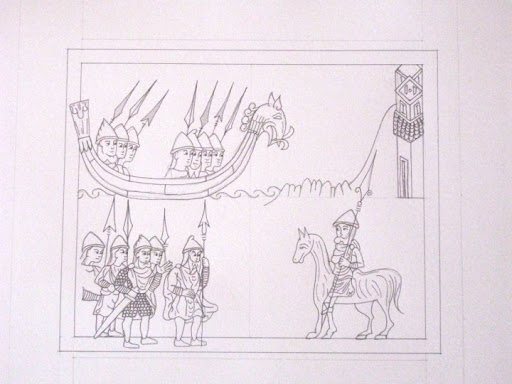
The scene contains elements from several different folios in the Hexateuch all drawn together to illustrate what's going on. The ship is found on folio 14v & 14r, the tower is on folio 22r, the horse rider can be found on folio 47r, the armor to help separate Beowulf is the kings armor from folio 24v, and the group around Beowulf is taken from members of the army found on folio 25v.
The artists of the Hexateuch used a dry point method for doing their layout and general composition. I'll be using a mechanical pencil to do mine on the water color paper for my first attempt.
After everything is lined out, the Old English calligraphy is added. The page below contains lines 210 to 234 of Beowulf. They talk about Beowulf's journey and the Watchman that first meets him at the shore.
Next I'll add the illuminated scene.
The scene contains elements from several different folios in the Hexateuch all drawn together to illustrate what's going on. The ship is found on folio 14v & 14r, the tower is on folio 22r, the horse rider can be found on folio 47r, the armor to help separate Beowulf is the kings armor from folio 24v, and the group around Beowulf is taken from members of the army found on folio 25v.
Isaac
Thursday, May 27, 2010
The facsimile of the Old English Hexateuch that I'm using for the style of my Beowulf project is on a CD that came with the book, The Illustrated Old English Hexateuch, Cotton MS. Claudius B.iv: The Frontier of Seeing and Reading in Anglo-Saxon England, by Benjamin C. Withers.
For the text of Beowulf in Old English I'm using Beowulf – Bilingual Edition, by Seamus Heaney.
Basic information on the Hexateuch:
11th Century Anglo-Saxon
330 x 220 mm (12.99 x 8.66 in)
38 lines of text per folio
~ 3 mm line height
The editors of the 1974 print facsimile of the Hexateuch, C.R. Dodwell and Peter Clemoes, indentified five stages of completion of the illustrations in the manuscript.Withers describes these various stages and identifies groupings in his book on pages 26 and 27. They are as follows:
Stage 1: The artist sketched the outlines of his composition in dry pointing (folio 149v - 159v)
Stage 2: The artist painted solid blocks of color as needed on draperies, animals, architecture, and frames (folio 143r-149r)
Stage 3: The artist outlined heads, arms, bodies, swords, frames, etc using red ink (folio 101-127v)
Stage 4: The artist adds details to the face such as eyes, nose, and mouth (folio 78-100v)
Stage 5: The artist completes the drapery, defining folds and contours. (folios 2r - 76v)
For Grendel, I'm planning on using a humanoid monster that's found in LIBER VITÆ: the Register and Martyrology of Newminster and Hyde Abbey, Winchester, written about 1016-1020. The image below can be found here.

LIBER VITÆ is part of the British Library's Catalog of Illuminated Manuscripts and can be found here.
Isaac
Tuesday, May 25, 2010
Current Project: Beowulf
My current scribal type project is my longest project to date. The idea light bulb went off back in April of 2009 and I've been progressing little by little on the project since then. So far it's research, research, research, practice at calligraphy, and a little bit of sketching. I'm using the Old English Hexateuch, Cotton MS. Claudius B.iv as an example to work up at least a few pages of lines from Beowulf.
Wikipedia Article on the Hexateuch found here
Wikipedia Article on the Hexateuch found here
Isaac
Subscribe to:
Posts (Atom)